
 Portal
Latest topics
» Forumactif Edge - Releases
by Ange Tuteur Tue 03 Sep 2019, 11:49
» GIFActif - Giphy Button for the Editor
by Ange Tuteur Wed 08 May 2019, 17:21
» Forum Closure
by Ange Tuteur Mon 01 Jan 2018, 01:28
» Chit Chat Thread
by Valoish Sun 31 Dec 2017, 19:15
» Font/Text background color.
by Valoish Sun 31 Dec 2017, 19:11
» Forumactif Messenger - Instant Message Application for Forumotion
by Wolfuryo Sun 31 Dec 2017, 18:24
» [GAME] Count to One Million!
by brandon_g Fri 29 Dec 2017, 18:58
» Post Cards
by manikbiradar Wed 20 Dec 2017, 07:50
» [GAME] Countdown from 200,000
by Valoish Wed 13 Dec 2017, 23:22
» GeekPolice Tech Support Forums - GeekPolice.net
by Dr Jay Mon 11 Dec 2017, 19:12
» Asking about some plugin for Forumotion
by Dr Jay Mon 11 Dec 2017, 19:10
» [GAME] What are you thinking right now?
by Van-Helsing Sat 09 Dec 2017, 14:51
» Widget : Similar topics
by ranbac Wed 06 Dec 2017, 18:11
» Change the Background of the Forum and put an image and how to make prefixs?
by Clement Wed 06 Dec 2017, 15:19
» Hello from Western Australia
by SarkZKalie Wed 06 Dec 2017, 05:34
Recent Tutorials
Top posting users this month
Top Achievers
Who is online?
In total there are 24 users online :: 0 Registered, 0 Hidden and 24 Guests :: 2 Bots
None
Most users ever online was 515 on Tue 14 Sep 2021, 15:24
None
Most users ever online was 515 on Tue 14 Sep 2021, 15:24
Fonts NOT to Use
Page 1 of 1 • Share


- Anita

- Gender :

Posts : 26
Points : 2822
Reputation : 10
Location : [404 - Not Found]
Language : English, Spanish, Rubbish
Browser : Forum Version :
 Anita Wed 03 May 2017, 10:42
 Hi, everybody!
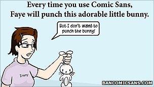
As many of you are great graphic designers (intuituvely or professionally), I'm sure you must really know which fonts must be avoided. Apart from the already negative reputation that Comic Sans has got, is there any other font you can't put up with?
For example, I think Papyrus makes a website look funny.
Let alone when papers or documents with this font are submitted.


- dannig
- Gender :
Age : 37
Posts : 36
Points : 2873
Reputation : 11
Location : Brazil
Language : English, Brazilian-Portuguese
Browser : Forum Version :
 -


dannig Wed 03 May 2017, 13:44
Loved the thread!
You should really mention Comic Sans too. That's dreadful...
You should really mention Comic Sans too. That's dreadful...
- Anita
- Gender :
Posts : 26
Points : 2822
Reputation : 10
Location : [404 - Not Found]
Language : English, Spanish, Rubbish
Browser : Forum Version :
Anita Wed 03 May 2017, 19:48
Yeah! Last month I got a CV written in Comic Sans. We just looked at each other here in the office, just like saying, "Thanks for trying. Next!"
It reminds me of an BBC Magazine article about Comic Sans about this disgraced font.
Impact is another font which I just find awful. But I totally lost respect to the font when it started being used in Internet memes.
Use it somewhere else and you'll be likely not to be taken seriously.
It reminds me of an BBC Magazine article about Comic Sans about this disgraced font.
Impact is another font which I just find awful. But I totally lost respect to the font when it started being used in Internet memes.
Use it somewhere else and you'll be likely not to be taken seriously.
- Valoish
 Graphic Designer
 - Gender :
Age : 28
Posts : 3671
Points : 7363
Reputation : 360
Location : NYC
Language : English, Russian, Hebrew
Browser : Forum Version : 
-
Valoish Wed 03 May 2017, 21:22
Ughhh all 3 above are fonts I just can't deal with o_e' I've used Impact before but only when 1. it was specifically asked for or 2. it was in the instructions of the professor x_x Personally hated using it, and would have preferred if Arial Black was used instead..
Another two I try to avoid at all costs are Courier and Brush Script. Courier just looks so old and outdated and.. too mechanical for me Idk. Can't do anything fun with it and it's way too thin for any sort of effects to be applied. Brush Script is just a font I can't work with; Idk why but whenever I use it I end up disliking the design and rethinking the entire idea LOL.
Another two I try to avoid at all costs are Courier and Brush Script. Courier just looks so old and outdated and.. too mechanical for me Idk. Can't do anything fun with it and it's way too thin for any sort of effects to be applied. Brush Script is just a font I can't work with; Idk why but whenever I use it I end up disliking the design and rethinking the entire idea LOL.
- dannig
- Gender :
Age : 37
Posts : 36
Points : 2873
Reputation : 11
Location : Brazil
Language : English, Brazilian-Portuguese
Browser : Forum Version : -
dannig Thu 04 May 2017, 08:10
I like Courier if I need to create a "old computer" effect on something or for coding display, because it's basically the most common style of font for displaying raw html, css, etc.
- Dr Jay

- Gender :

Posts : 156
Points : 3173
Reputation : 35
Location : USA
Language : English (Native)
Browser : Forum Version : -
Dr Jay Thu 04 May 2017, 15:37
What about favorites?
I have personally loved using these in my designs (almost in order from best to okay):
-Blue Highway
-Roboto
-Modern No 20
-Gotham
-Hermes
-Enclave
-Helvetica
-Rockwell
-Verdana
I have personally loved using these in my designs (almost in order from best to okay):
-Blue Highway
-Roboto
-Modern No 20
-Gotham
-Hermes
-Enclave
-Helvetica
-Rockwell
-Verdana
- Anita
- Gender :
Posts : 26
Points : 2822
Reputation : 10
Location : [404 - Not Found]
Language : English, Spanish, Rubbish
Browser : Forum Version :
Anita Sun 07 May 2017, 19:56
Those are wonderful Fonts, @Dr Jay!  From your list, my favourite ones are Roboto, Modern No 20, Gotham, Enclave and Helvetica.
Back to not very appealing fonts... While I don't mind using Calibri, every time I see a document or presentation in this font, I feel like the doc's been sort of improvised, and its layout is totally unattractive. I don't know why, it's a funny thing, as it doesn't happen, for instance, with Helvetica.
Perhaps it's because Windows users, like me, are overusing this default font.
Algerian is another font which I find funny.
And I couldn't agree more with you, @Valoish, Brush Script is not ugly per se, but I think it's been so overused,particularly in .... I don't know... cheesy contexts, that we can't help ending up disliking it. And even though there are fonts with the same concept (e.g. Signalist), perhaps Brush Script is too much for the eye.
- JerriLeah7
 Graphic Designer
 - Gender :
Age : 35
Posts : 381
Points : 3853
Reputation : 203
Language : English, Sign Language
Browser : Forum Version : 
-
JerriLeah7 Mon 08 May 2017, 03:41
Okay, mini-rant here...
Lots of Fairy Tail forums out there, as well as One Piece forums. And so many people ask for those specific fonts on small buttons. x.x' I have to explain every time that those fonts are meant for larger images, not buttons. Have you SEEN those on tiny buttons? It's terrible. TERRIBLE.
I personally prefer more flexible fonts that can look good on various sizes. ^^ I think my favorite font to use is Optimus Princeps.
- Anita
- Gender :
Posts : 26
Points : 2822
Reputation : 10
Location : [404 - Not Found]
Language : English, Spanish, Rubbish
Browser : Forum Version :
Anita Mon 08 May 2017, 20:27
LOL! Small buttons in Algerian is like an elephant on high heels! 
I didn't know Optimus Princeps. What a beautiful font, @JerriLeah7! And I agree: it's a fancy and flexible font to be used in small buttons. No doubt it will be mentioned very soon, when someone starts a thread on favourite fonts!

- SLGray
 Valued Member
 - Gender :
Age : 51
Posts : 2465
Points : 7350
Reputation : 290
Location : United States
Language : English
Browser : Forum Version : 
-

SLGray Wed 10 May 2017, 21:55
I wonder why did Microsoft remove Papyrus from Windows 8.1. I like Papyrus and Parchment. There are others, but too many to list.
- Sponsored content
Sponsored content

Create an account or log in to leave a reply
You need to be a member in order to leave a reply.
Page 1 of 1
Permissions in this forum:
You cannot reply to topics in this forum